My Role
Senior UX Designer for Job Posting
Overview
Indeed introduced Premium sponsorship to drive revenue, but only 19% of eligible employers were adopting it. The business needed a 2% lift to justify the investment. Product wanted to interrupt users mid-flow with modals. I advocated for a trust-based approach that would earn the right to recommend.
Design Principles
Trust-Based Design
Drawing from my background in crisis counseling and luxury retail sales, I recognized that trust requires understanding before recommending. In sales, you don't pitch immediately; you listen, acknowledge, then earn the right to advise.
Active Listening

Translating to Digital
Disruptive modals would break the listening pattern. If we interrupt mid-flow, we would be signaling "we want your money" before proving "we understand your needs". Timing was really important here to build trust with the user.
Challenges
Business Opportunity
70% of job postings qualified for Premium sponsorship based on hiring complexity, but only 19% were adopting. At $200 additional revenue per Premium job, a 2% lift would generate significant income.
Hypothesis for lack of Premium adoption: We were pitching Premium after job completion with no connection to what employers told us during posting.
User Experience Gap
Employers experienced our funnel as "post for free," spent time crafting their job posting, then were hit with a sponsorship pitch at the end. It felt like a bait-and-switch. We weren't connecting their specific hiring needs to our Premium recommendation, making it feel generic and transactional.
Stakeholders Initial Plan
Interrupt users mid-flow with modals or forced interstitials to push Premium earlier. The hypothesis: earlier exposure would drive adoption.
UX Risk: Breaking trust by pitching before we understood their needs.
Influencing Stakeholder Direction
The Challenge: Product wanted disruptive modals. I needed to convince them to wait until review.
My Approach: I walked stakeholders through a real-world scenario. "When you're buying a watch, when do you want the salesperson to make their pitch? If they approach too early, you feel sold to, not understood. Timing determines trust."
The Outcome: Team agreed to test the trust-based approach.
Research Validation
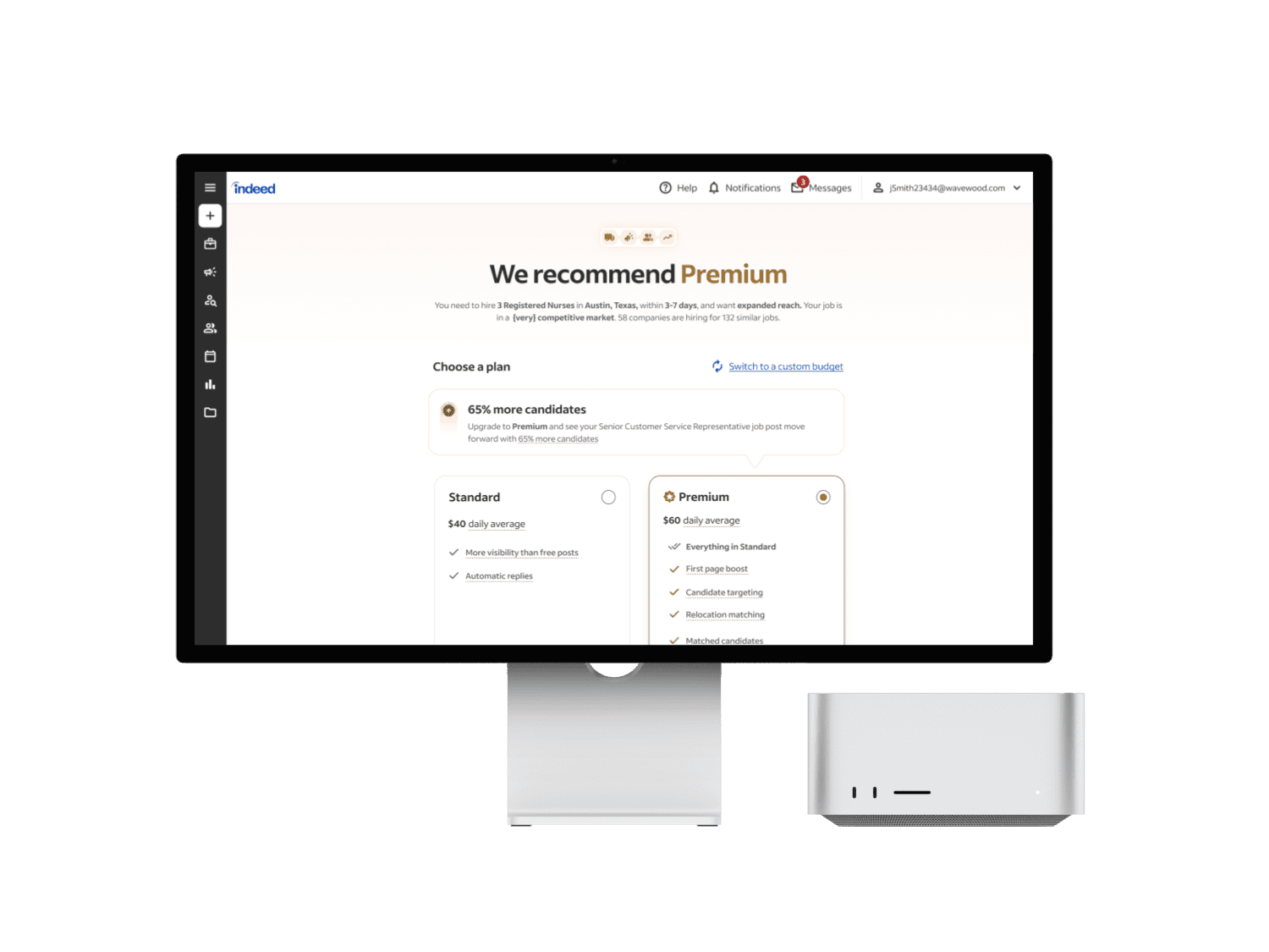
Partnered with UX research to test three variations of Premium recommendations. My trust-based design with contextual right rail messaging outperformed alternatives.
Key Findings:
Users understood the connection between their inputs and our recommendation
Timing felt appropriate (review page, not mid-flow interruption)
Recommendation felt credible and personalized, not generic
The Solution: A System Designed to Build Trust
Rather than designing isolated screens, I created an integrated system where every touchpoint reinforced that Indeed understood employer needs.
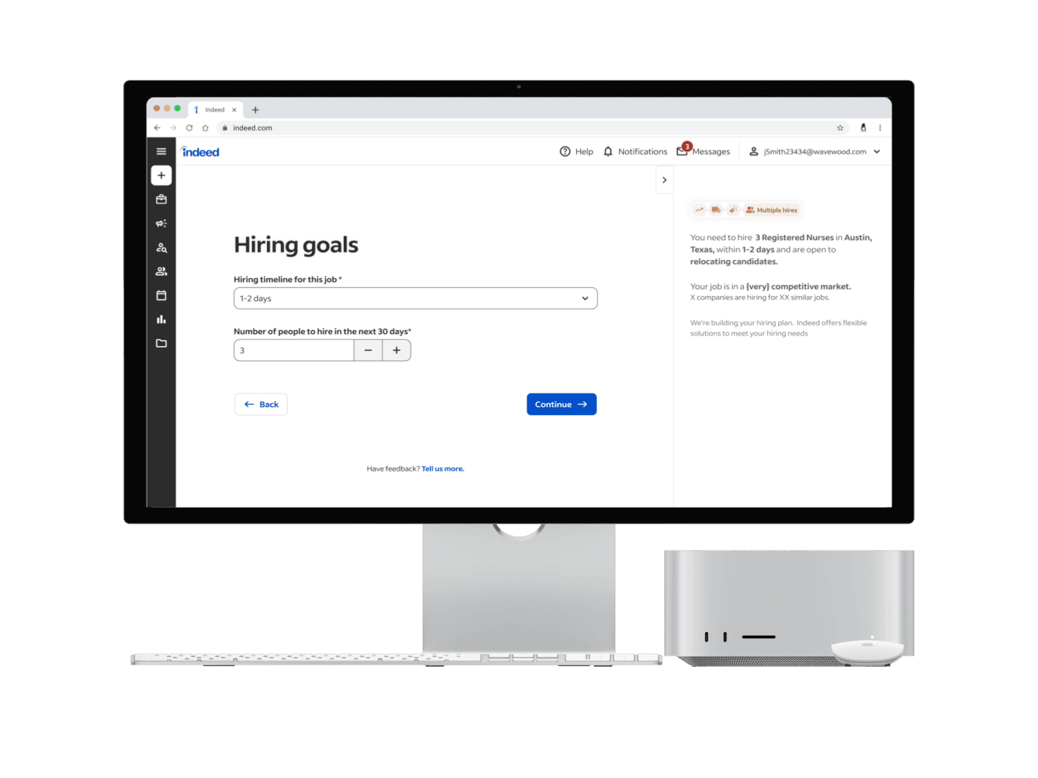
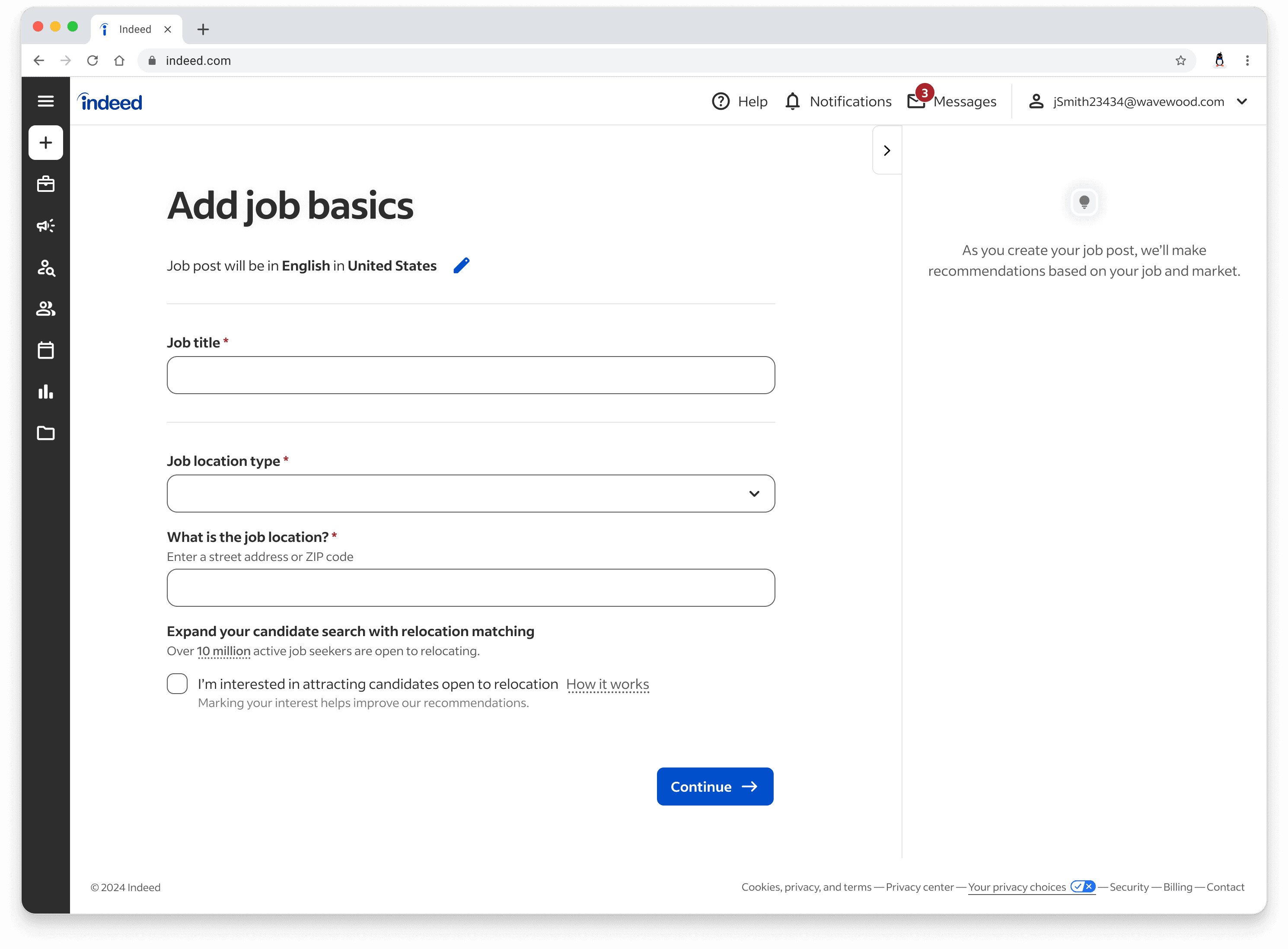
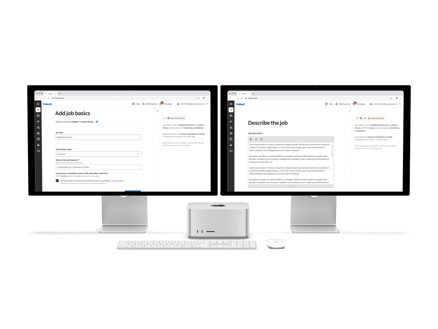
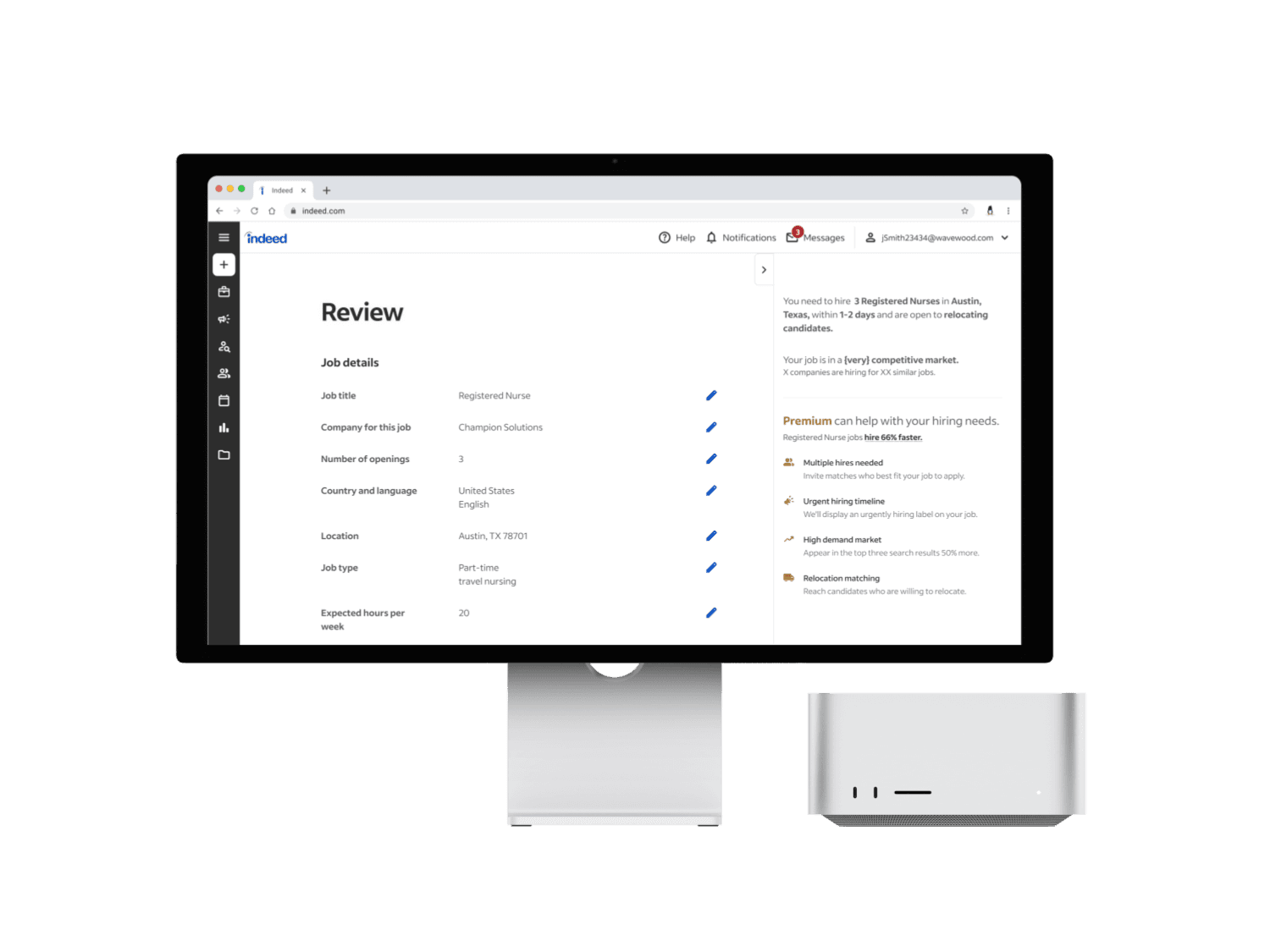
The Right Rail as Listening Canvas
Created a persistent sidebar that acknowledged employer inputs in real-time without disrupting their flow. As users answered questions, the rail dynamically reflected their hiring situation back to them.
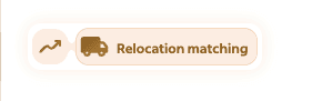
Dynamic Badge System
Designed icons that appeared instantly as users triggered Premium criteria. Each badge represented a complexity factor. Badges collapsed by default to minimize visual weight. On hover, they expanded to show labels. The most recently added badge stayed expanded, providing immediate feedback that we registered their input.
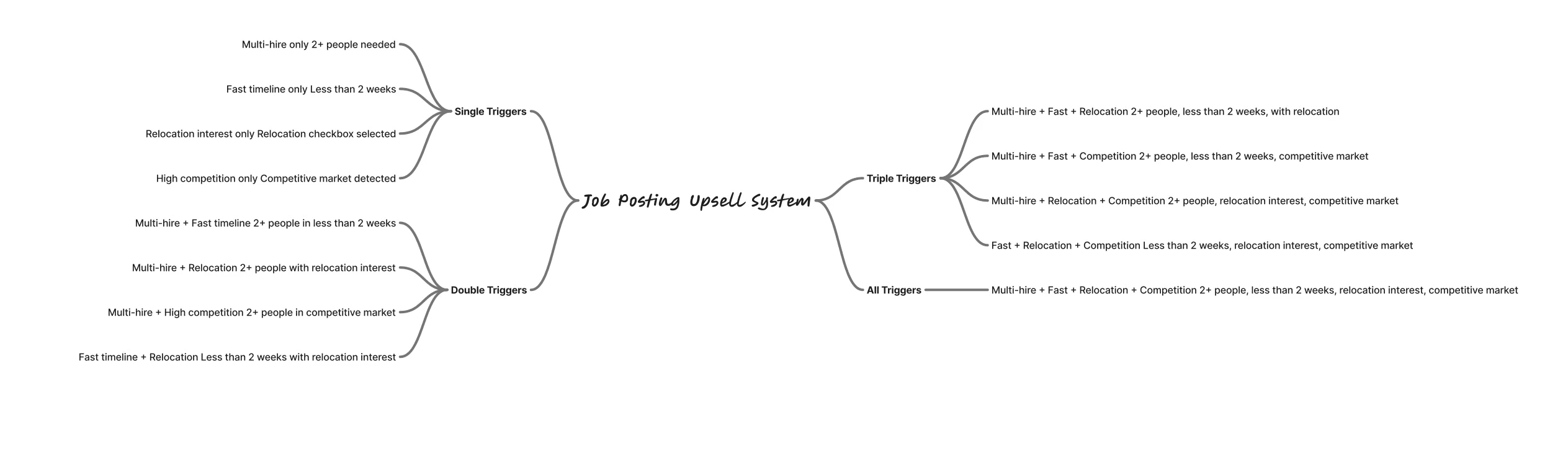
Strategic Trigger Mapping
Built a comprehensive trigger system mapping user inputs to Premium features. Product wanted Premium-only, but I designed for scalability—mapping Standard sponsorship triggers as well to future-proof the architecture.
AI-Powered Prototyping
Used Figma Make to prototype real-time badge animations. This was critical—static mocks couldn't convey how immediate visual feedback creates the feeling of being heard. The animation wasn't decorative; it was functional design demonstrating active listening.

Results
Why It Worked
The 8% lift wasn't from one element—it was from designing an integrated trust-building system where every touchpoint reinforced our value proposition.
Remove any piece and you break the trust loop:
Modal would interrupt listening
Earlier timing would feel presumptuous
Generic features wouldn't feel relevant
No acknowledgment would feel transactional
Systems Thinking Over Feature Design
Building trust isn't about perfecting one interaction—it's about designing a coherent system where timing, content, visual design, and interaction patterns all work together. The success came from the integration, not any individual element.
Understanding Before Recommending
This principle, translated from human sales interactions to digital product design, created measurable business value. Users needed to feel heard before they'd trust our advice. The data validated what behavioral psychology suggests: people respond to recommendations they believe are made with their best interests in mind.
Design as Strategic Platform
The right rail isn't just for Premium upselling—it's a strategic asset. By positioning it as "we deeply understand your hiring situation," we created infrastructure for standard sponsorship recommendations, other Indeed product suggestions, richer employer input collection and a consistent "Indeed is listening" experience
Measuring True Success
Premium adoption is a leading indicator, but the real metric is whether employers find enough value to return and sponsor again. Long-term trust drives lifetime value, and that depends on monetization delivering features that actually work.
Iterating Toward Personalization
Future versions should move beyond template-based messaging (inserting variables into stock text) to fully dynamic, contextual content tailored to each unique hiring scenario. The technical lift was too large for V1, but the architecture supports this evolution.